2021
Digital Wallet Corporation
Redesign Brand, UI/UX
UX/UI Designer

SMILES created Mobile application service, those who want send money from Japan to their hometown. SMILES builds application with user-friendly criteria, optimizing the design to help users transfer money quickly and simply.
Smiles is the first application in Japan licensed by FSA(Financial Service Agent), the product was first released in June 2017 and has 100k users using the product(2019). After more than 2 years of operation, the number of registrations and transactions gradually decreased.
Although it depends on many factors, the product has not had many updates in terms of User interface and User experience, which is the main problem that Shareholders want the Dev team to renew product.
- Rebuild new brand identity for existing products (UI, typography, color,...)
- Optimize user experience to increase product performance
- Build a design system so that the can scalable in the future
UX research, UI design, brand identity

Initial research focused on better understanding users' needs related to remittance as well as measuring the extent to which these needs are held among their connections.
How do users register without support from the customer support team?
How do users interact with existing products?
What are users current pain points with existing products?
How to make the design eye-catching for users?
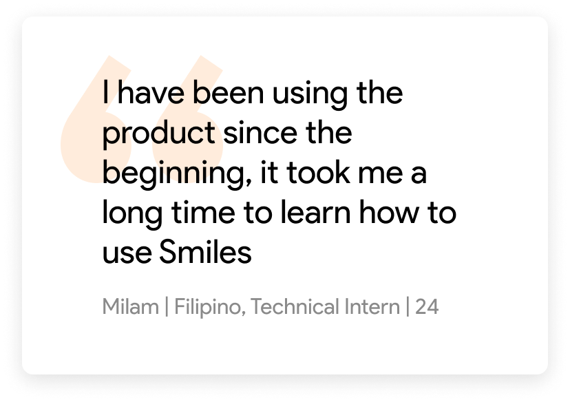
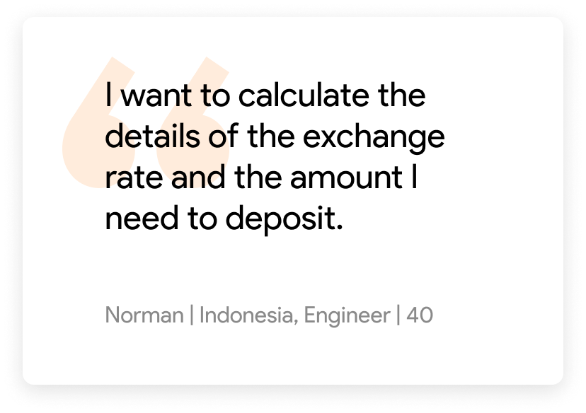
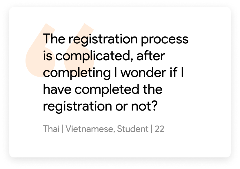
Setup interview with existing Smiles user: 50 users with 3 different nationalities (Filipinos, Vietnamese, Indonesian) including Student, Technical Intern, Pernaments visa status.
Interview languages: English, Vietnamese, Japanese
How do users register without support from the customer support team?
How do users interact with existing products?
What are users current pain points with existing products?
How can users check rates and fees before trading?
How to make the design eye-catching for users?
What is the highlight of Smiles compared to competitors in the market?
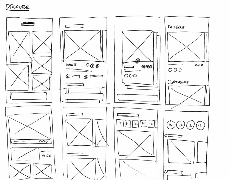
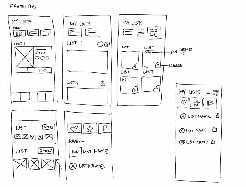
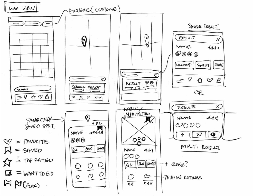
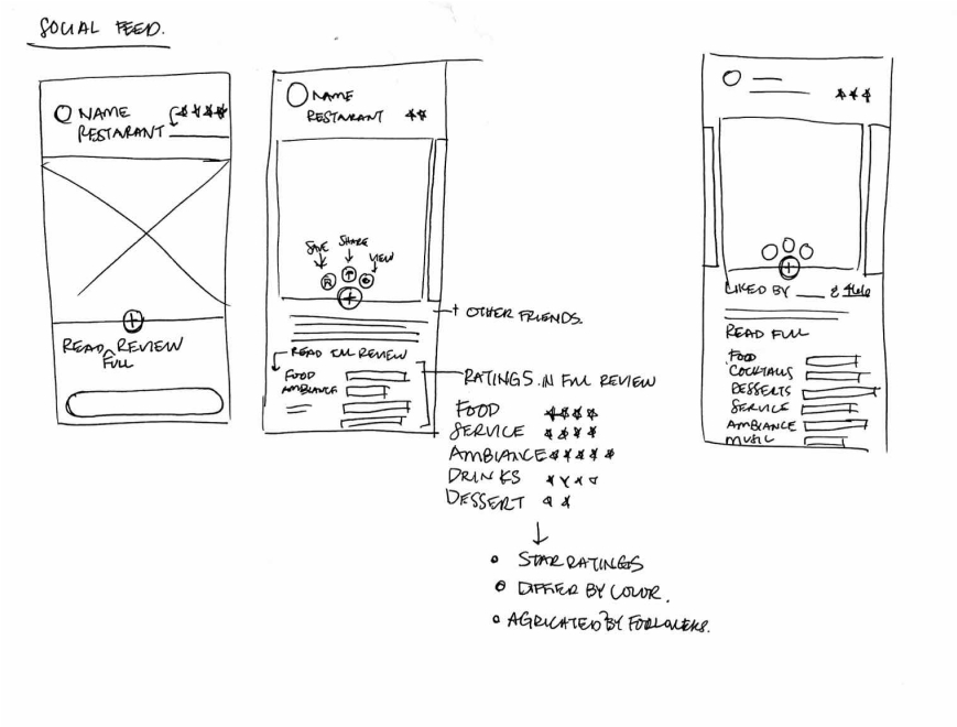
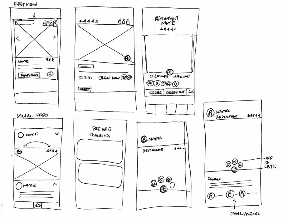
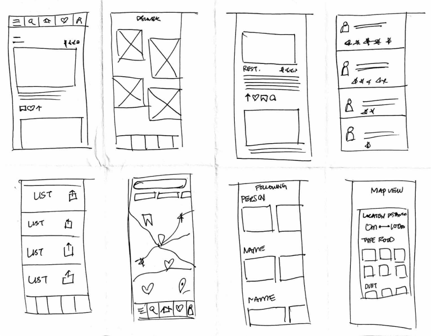
To kick-off the design process, quick sketches helped me get ideas on paper to establish which elements were necessary for each screen. A low fidelity prototype was then created for initial user testing.
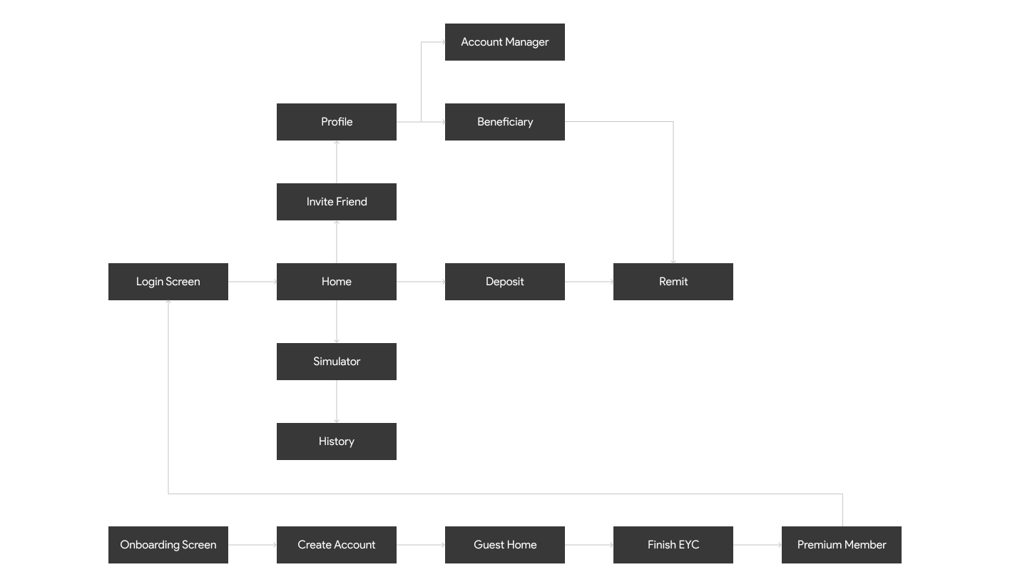
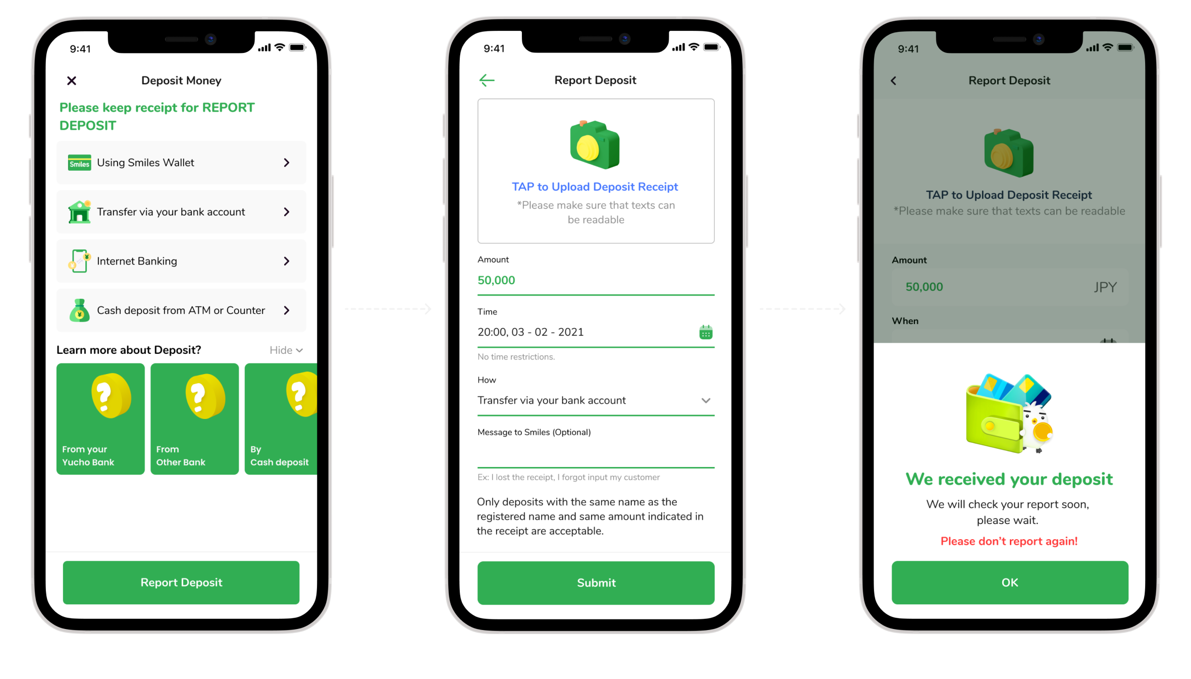
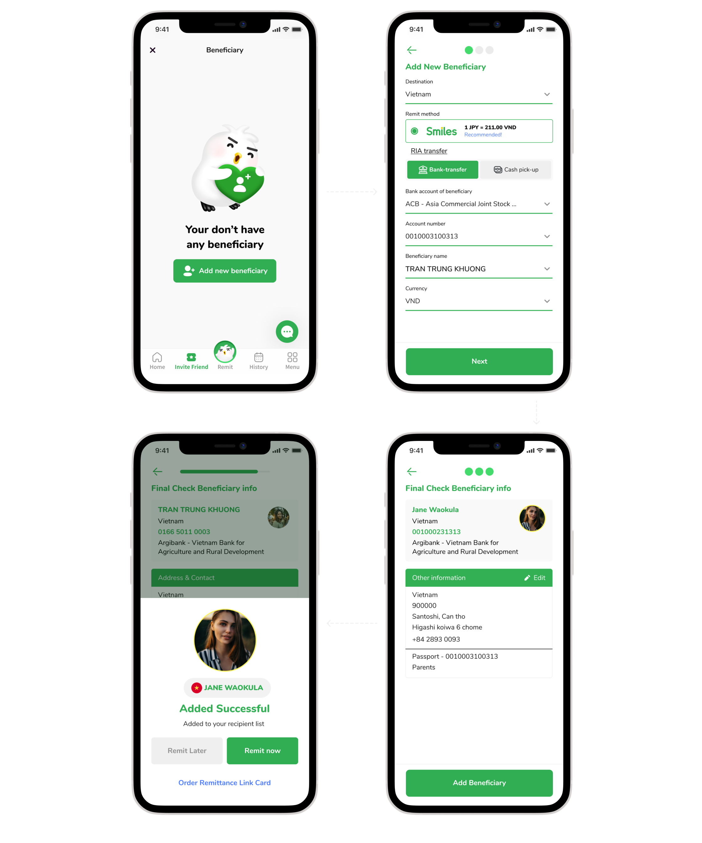
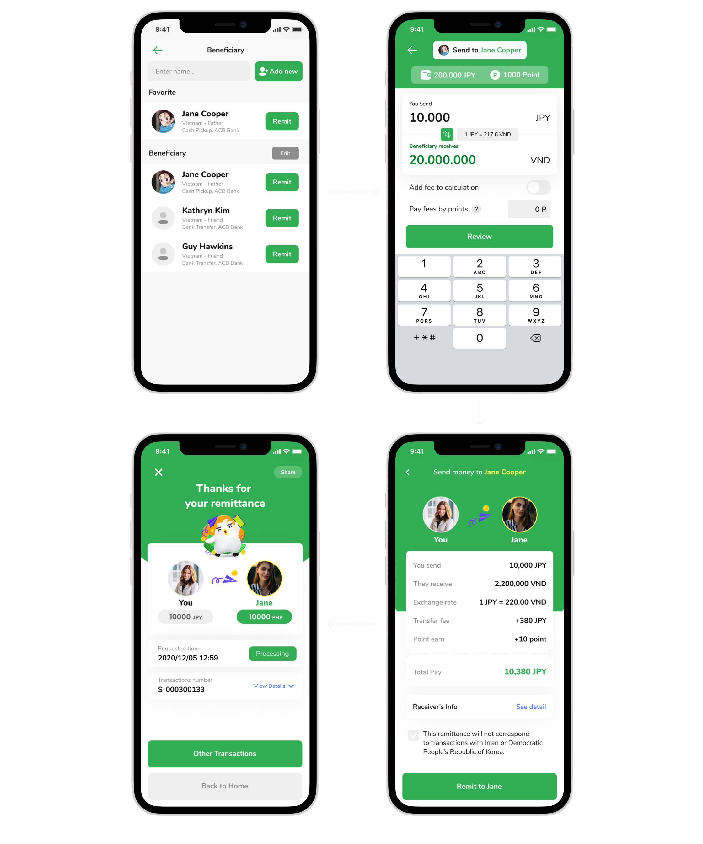
The primary user flow is the process of registration, deposit and remittance.
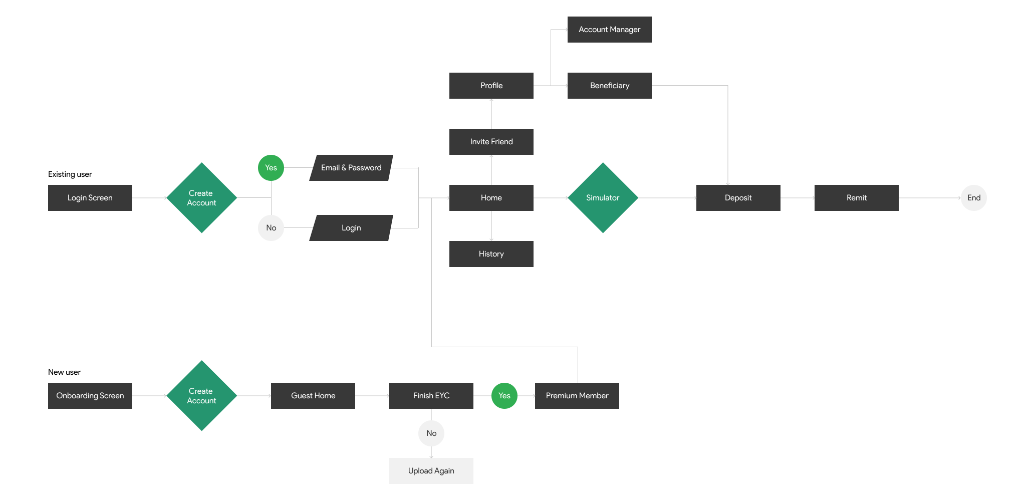
SMILES's simple information structure makes it easy to navigate and move through tasks.
Rough sketches were done to get my initial thoughts on paper and brainstorm new ideas for specific UI elements.
The registration process is complicated, it takes a lot of time to complete the registration and needs support from customer service
The information about the transaction is displayed very dimly, making the user confused about whether the money they have sent has arrived or not.
There is no simulator system to calculate before transferring money.
Optimizing the registration, deposit, and money transfer process based on the available flow.
Build simulator for users before transferring money.
Build UI components to unify all designs.
The new solution helps SMILES customers to check the real-time exchange rate and calculate it properly before making a transaction. Save travel time and cut unnecessary money
Intro screen and onboarding
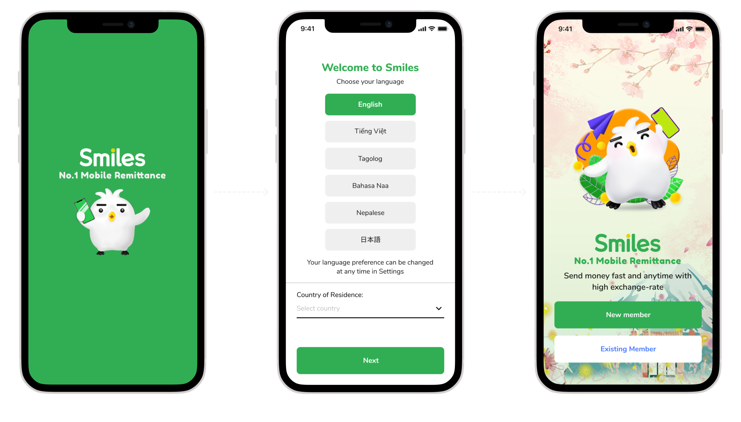
Using gamification design helps users give a good first experience of the product
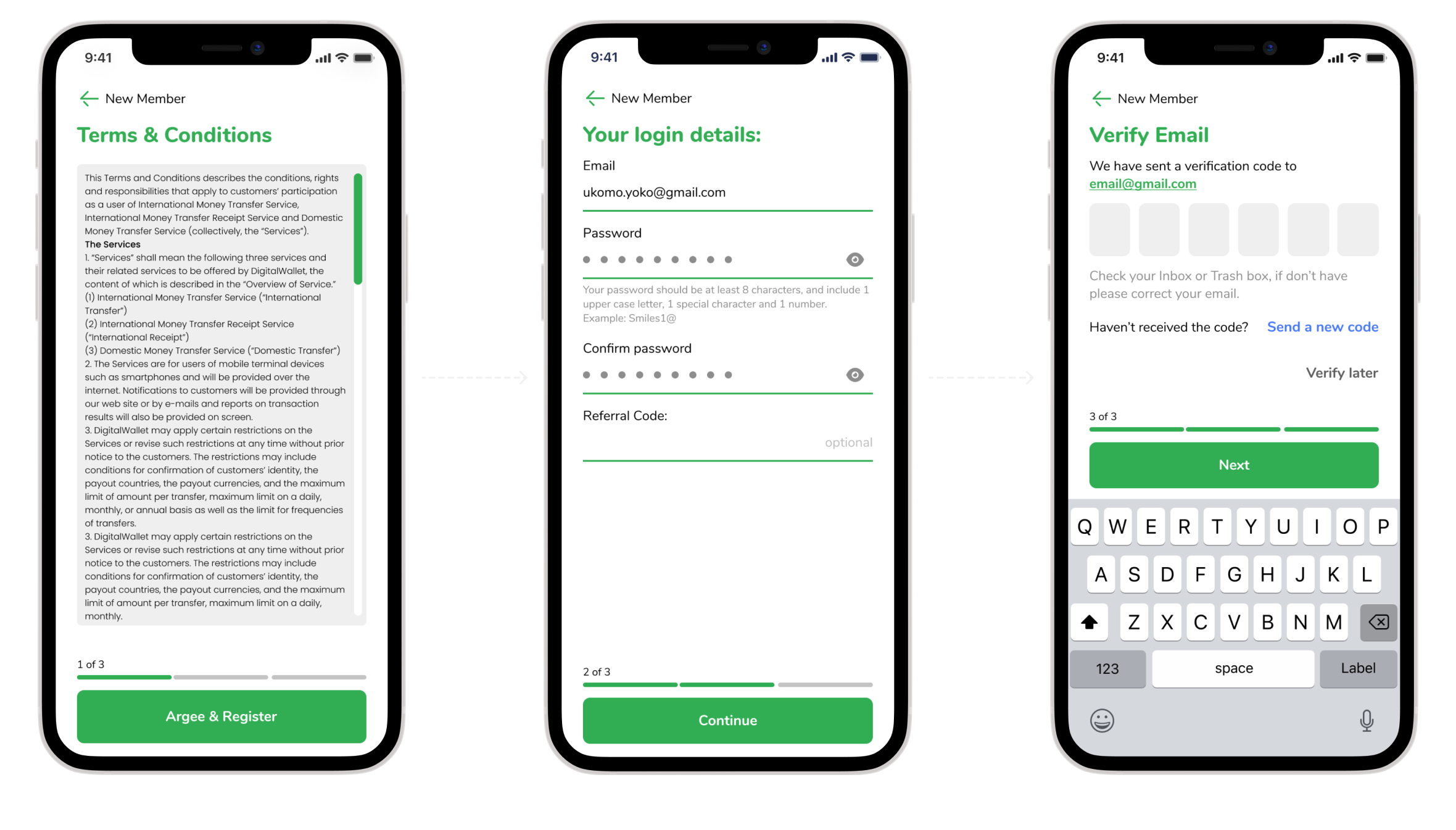
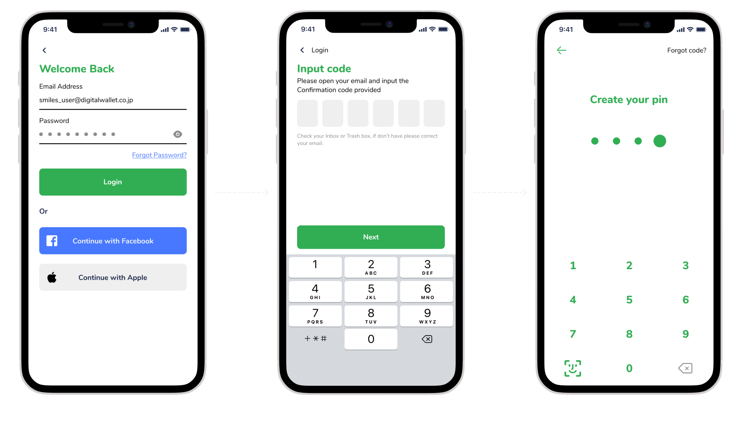
For existing users, just confirm the password once on the device.
Use AI to scan information on IDs to optimize input time from users
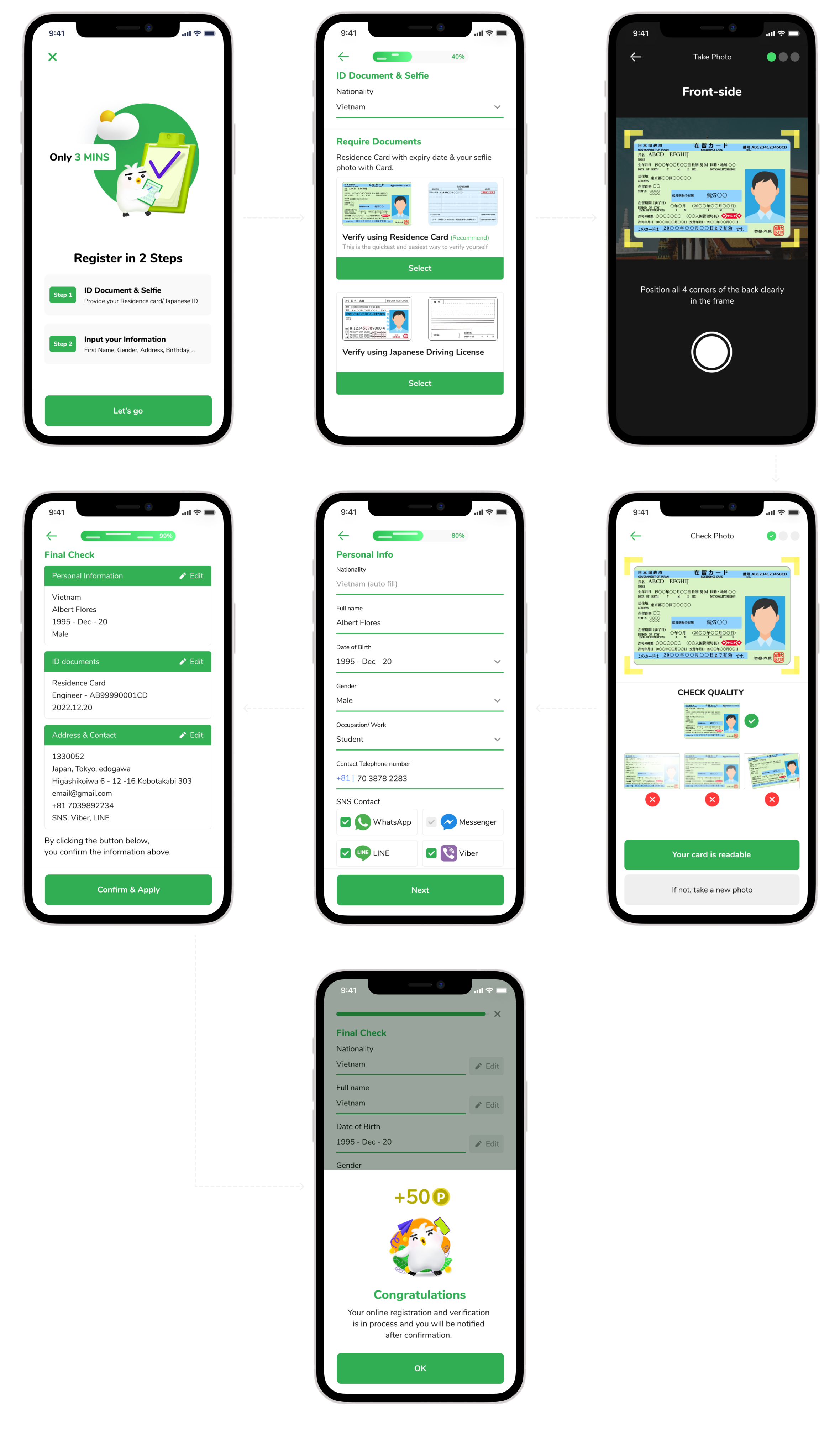
Cut down from 5 screens to 2 screens. Display the necessary information
Keep the current flow, change the interface
Attach Simulator real time to this section, streamline and add necessary notes.
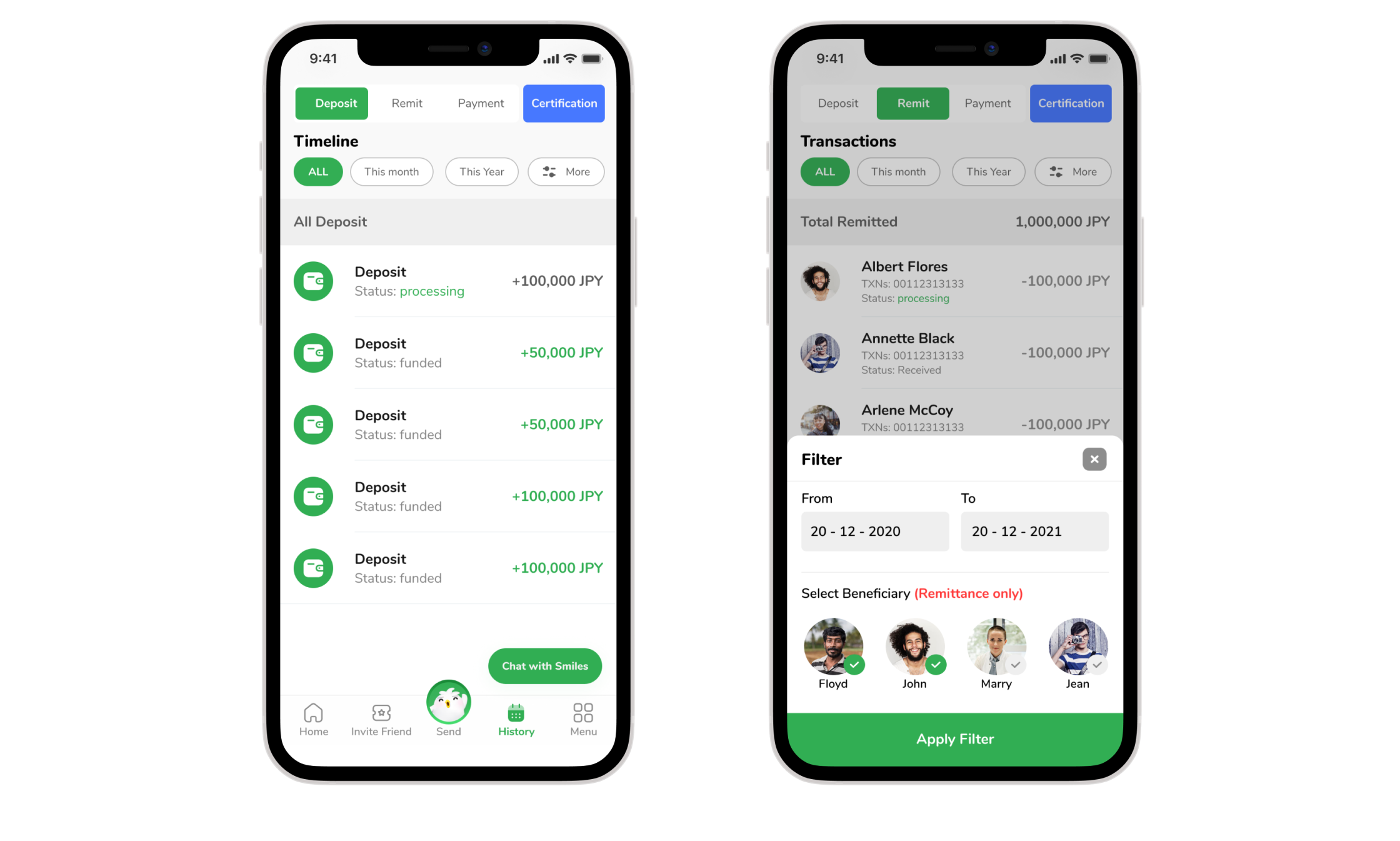
Summarize history (recharge, transfer, reward points) and add filter for easy interaction
Summary all information in onepage
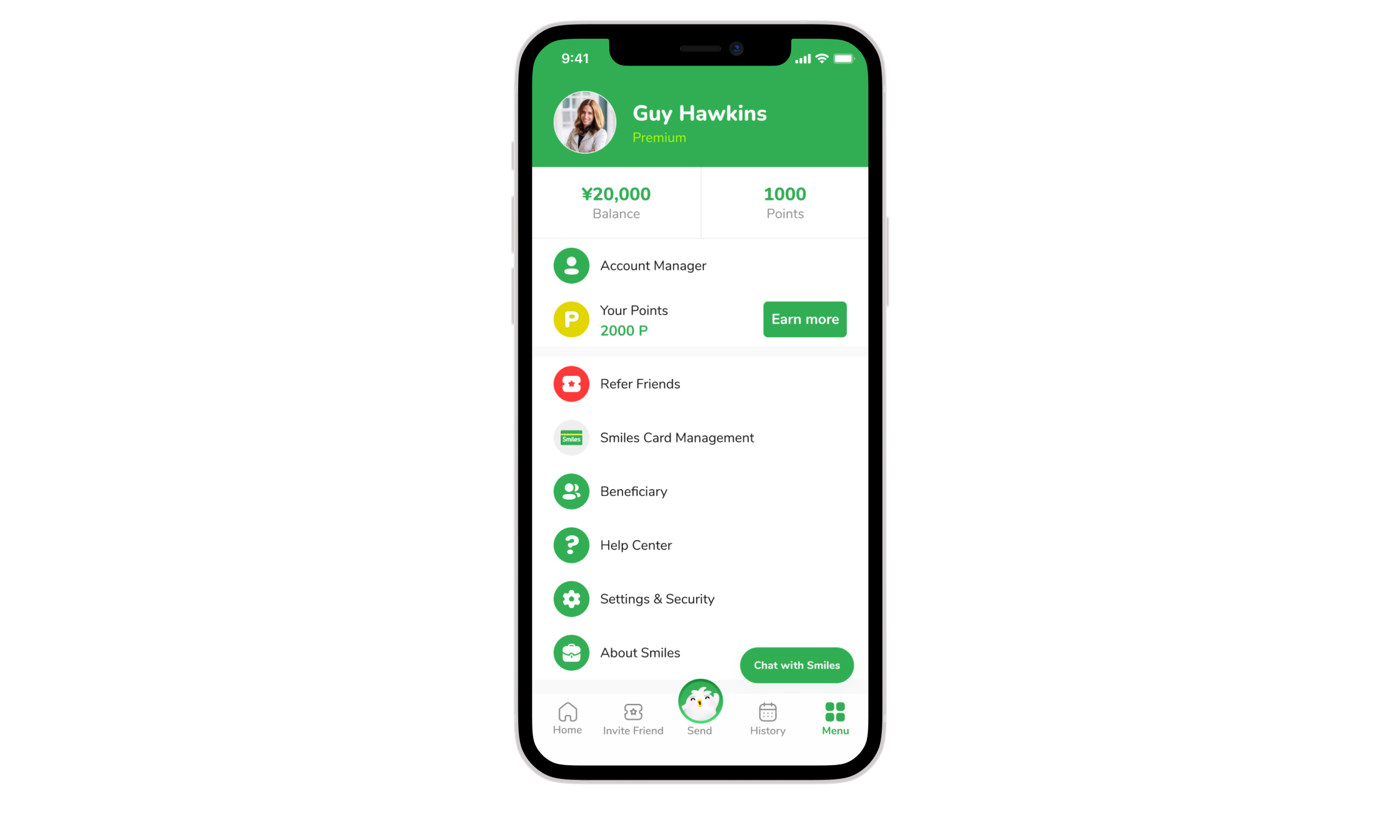
From Guest to Premium Member
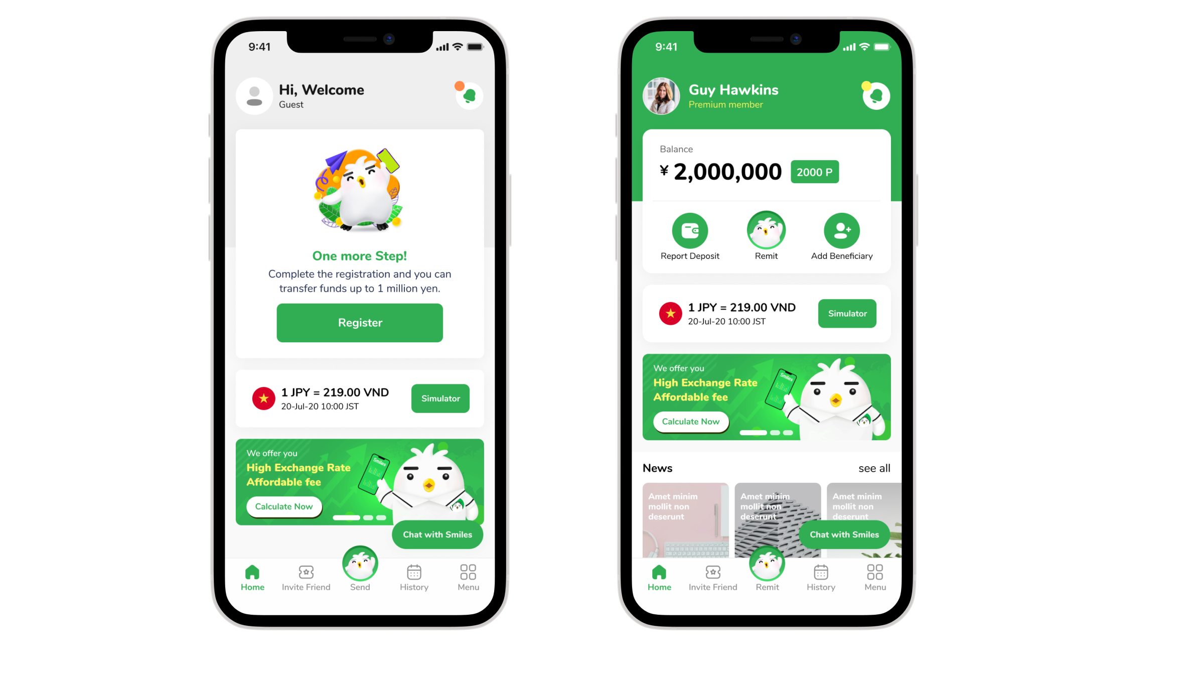
Integrates all needs into one streamlined experience
Increase user satisfaction (+40%), eKYC registration flow completion (+30%)
Transaction completion (+60%)
Sent almost 1 million transactions in 50 billion yen.
Help users check the exchange rate in the most convenient way
Won Good Design Award 2021.